Mangrove Surf Company

Building a family-run coastal apparel brand with a clear point of view, from its first mark and product line to the store, campaigns, and give-back model.
Visit Mangrove Surf Company01 · The assignment
Make a small surf brand feel rooted.
Mangrove began as a family project with my son: a coastal apparel brand shaped by St. Augustine, the water around it, and the people who stay close to both.
We needed more than a logo and a few shirts. The work had to become a usable identity, a product point of view, an online store, and a steady way to release new ideas without losing what made the brand feel local.
02 · The identity
A mark that could hold the whole idea.
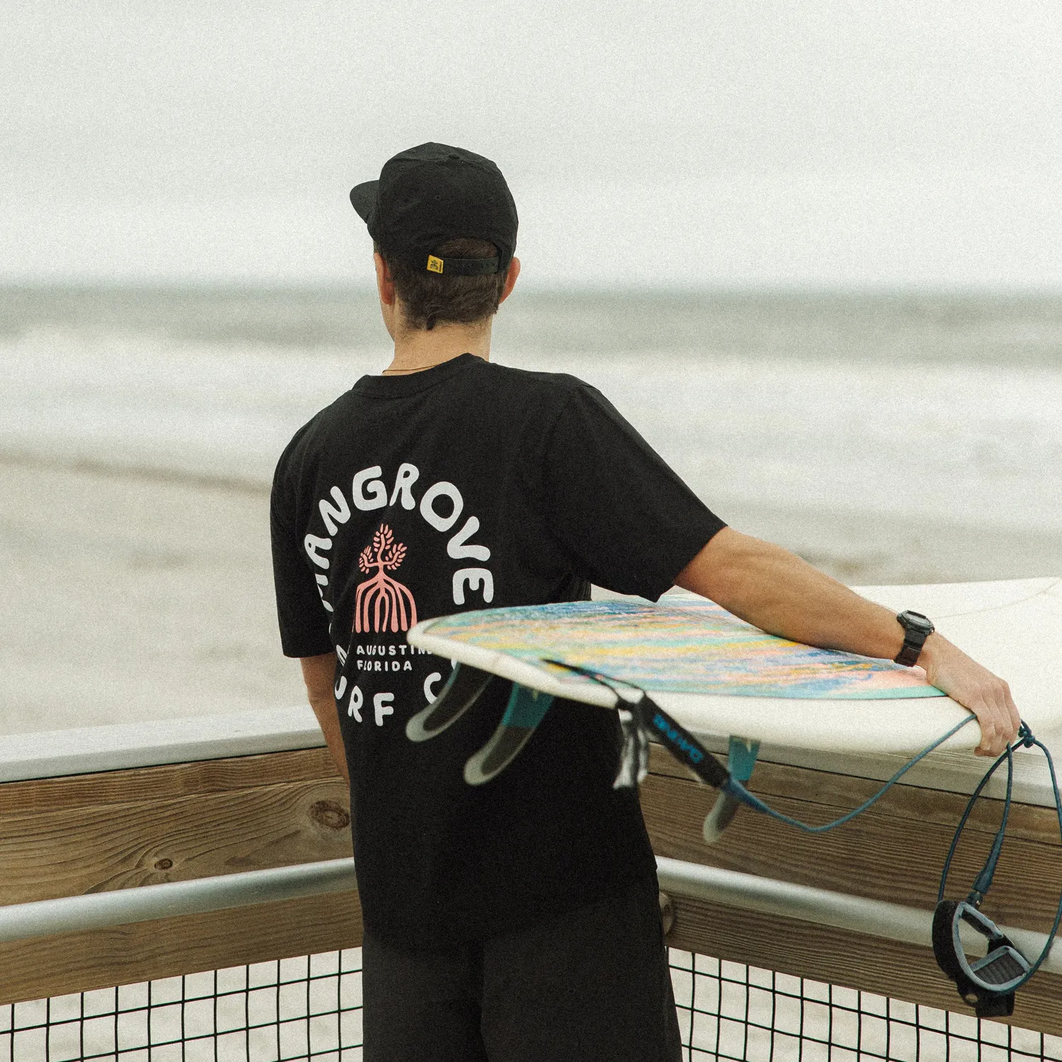
The mangrove tree gave the brand its center: coastal, resilient, and held in place by a root system most people never see.
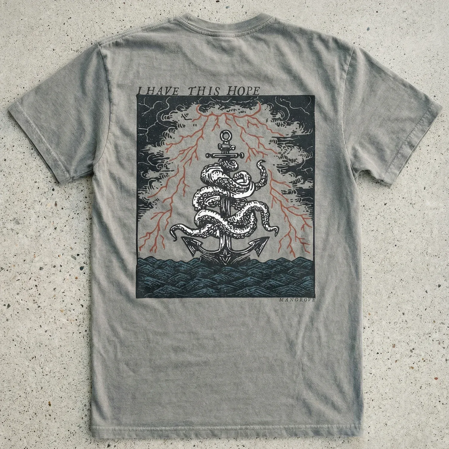
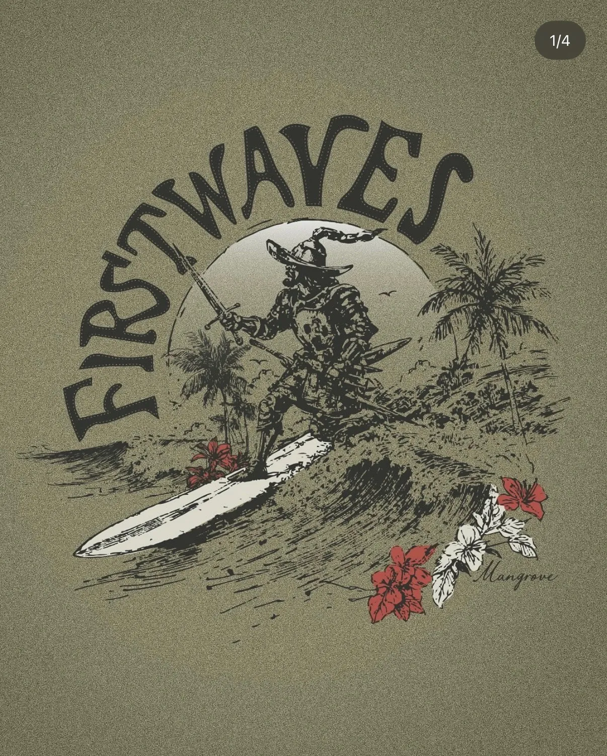
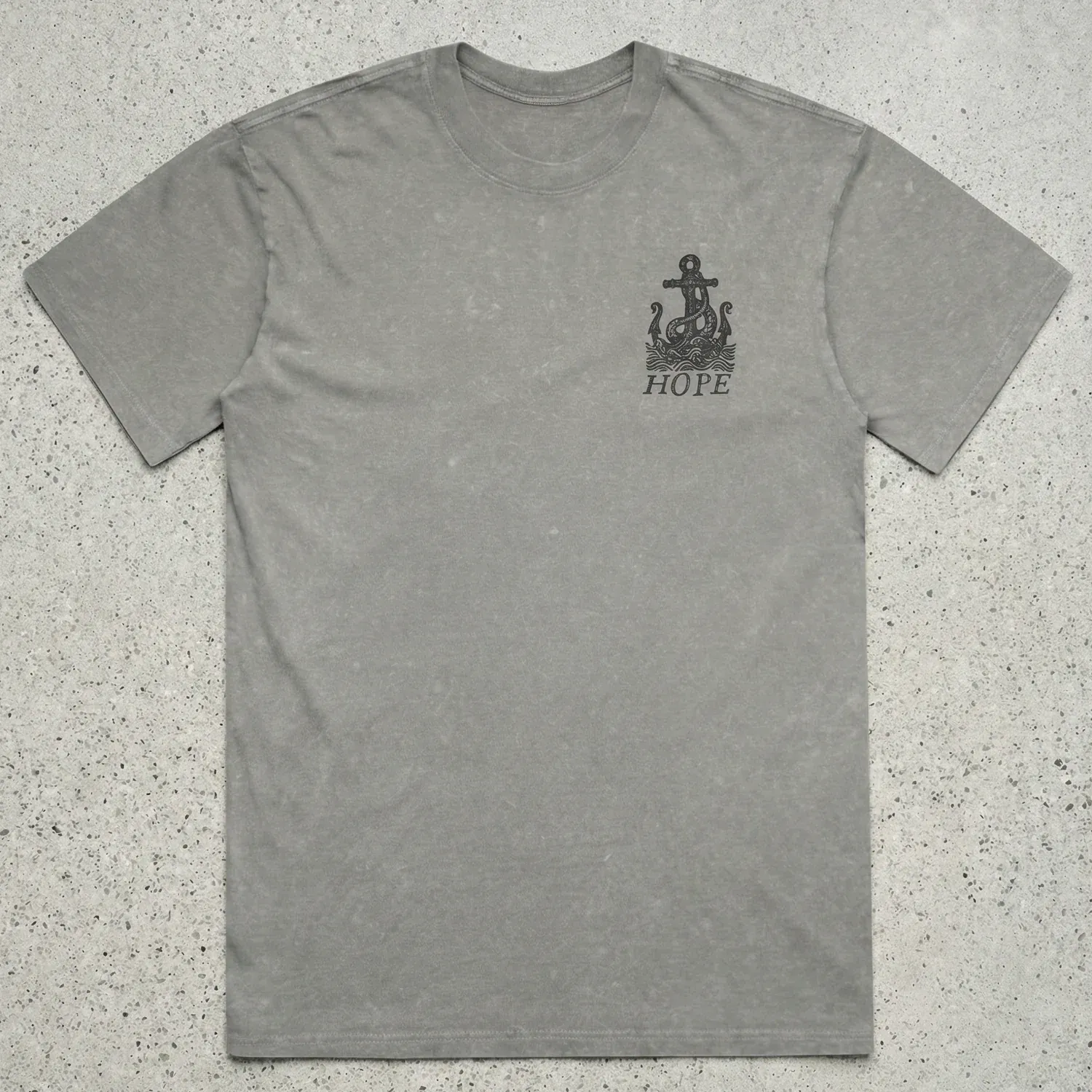
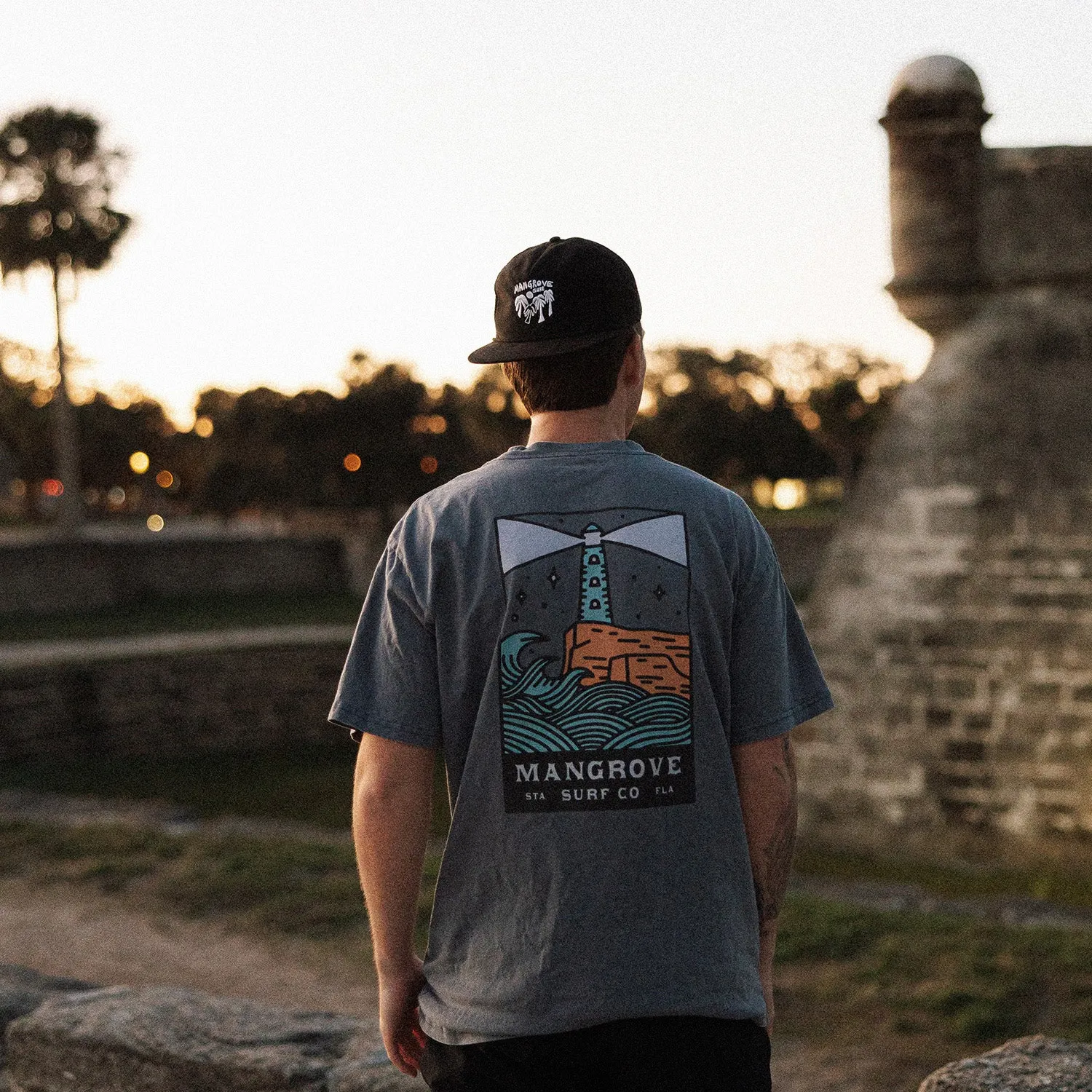
From there, the visual language could stay loose and expressive. Muted coastal colors, hand-drawn lettering, and detailed illustration gave each release its own character while the larger story stayed recognizable.
03 · The collections
Give each release a reason to exist.
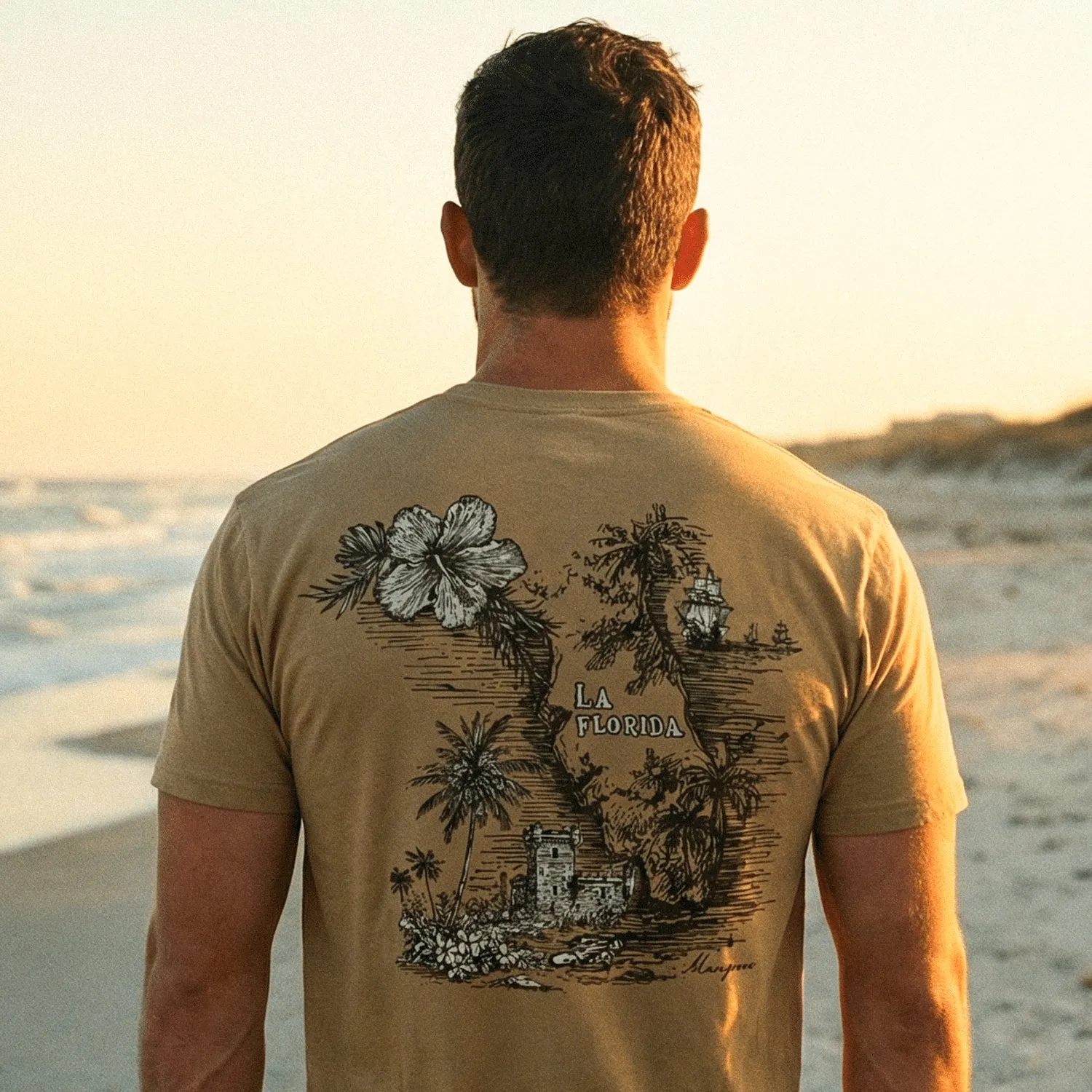
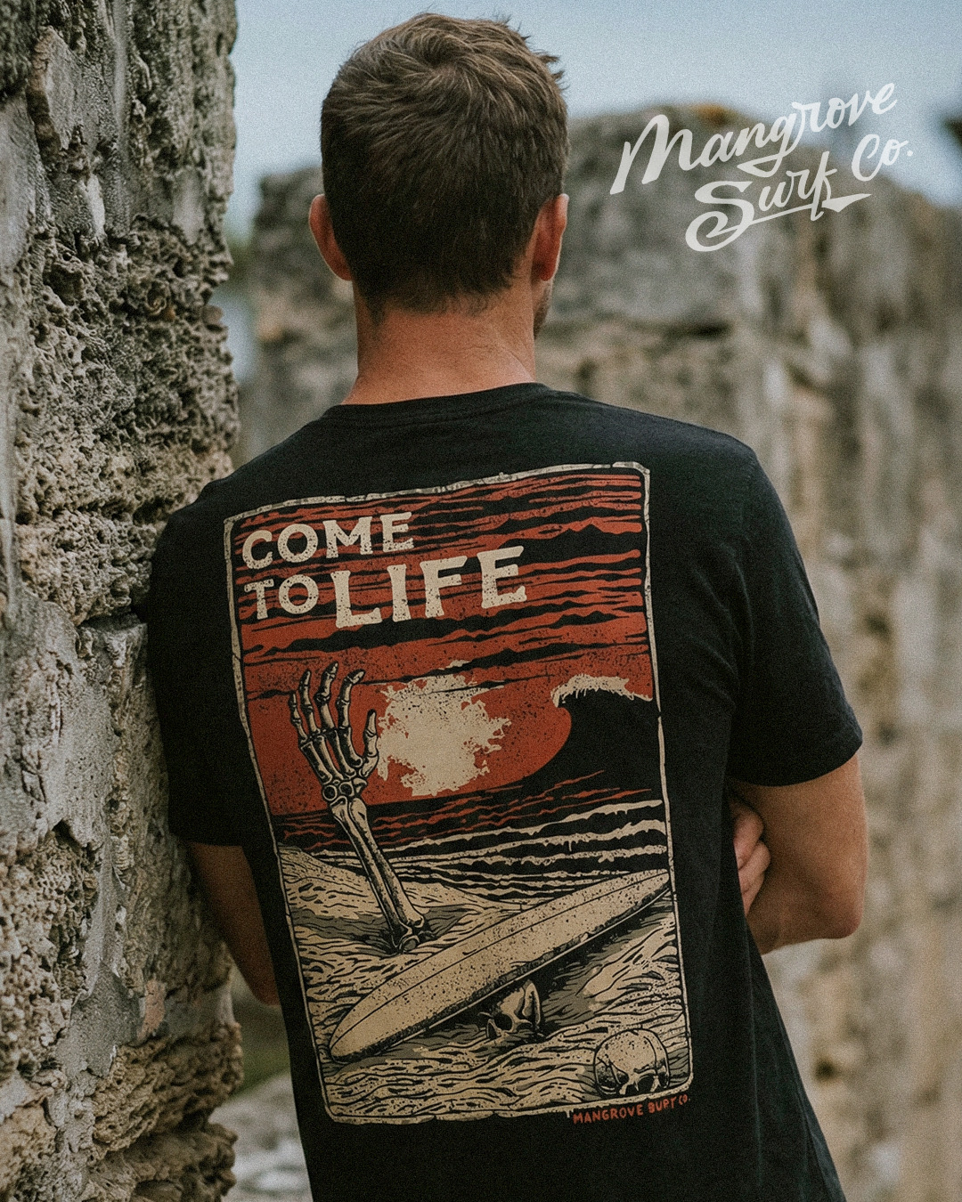
Collections became the working rhythm of the brand. A phrase, place, or piece of local history could become an illustration, then move across shirts, hats, hoodies, photography, and campaign language.
04 · In the landscape
The place had to remain visible.
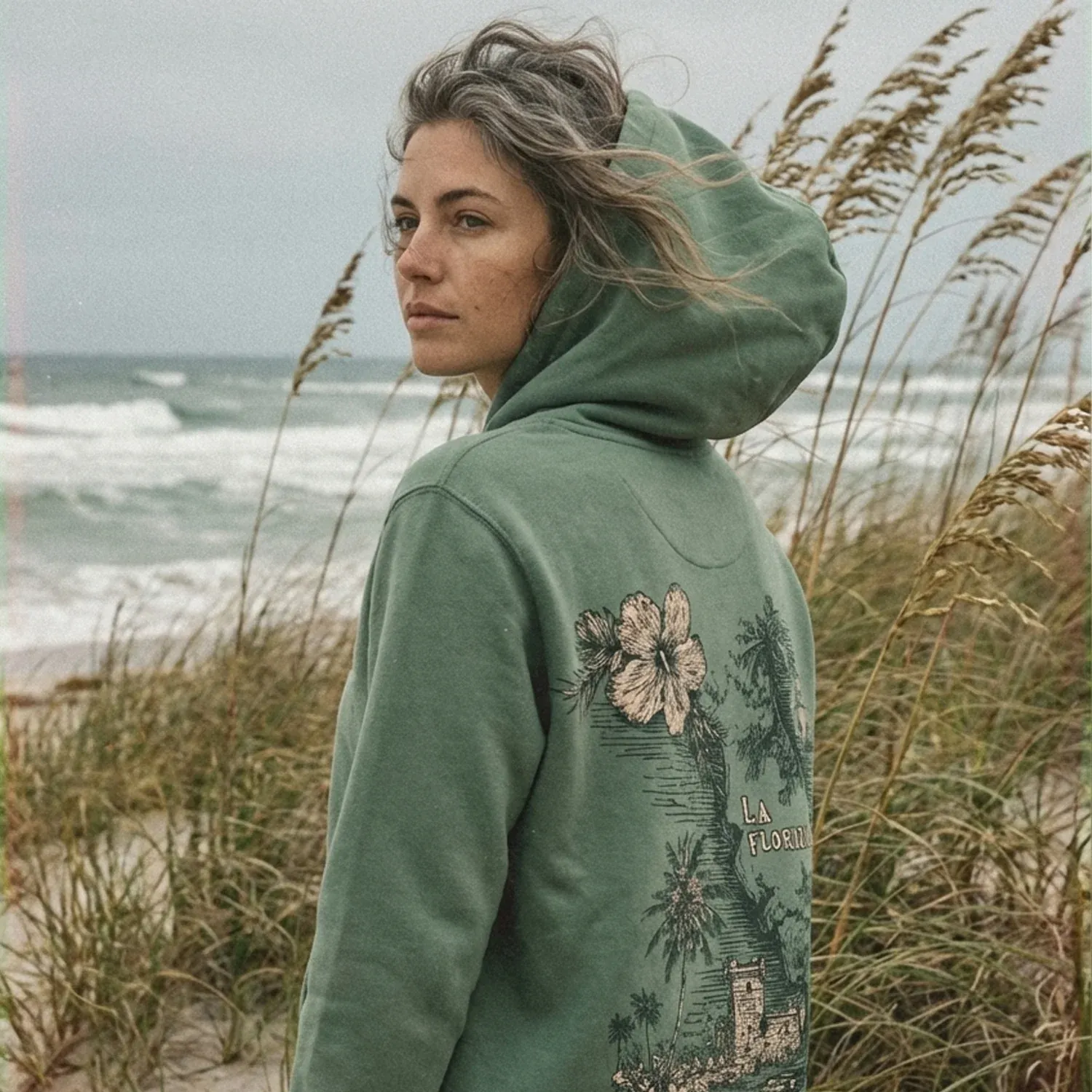
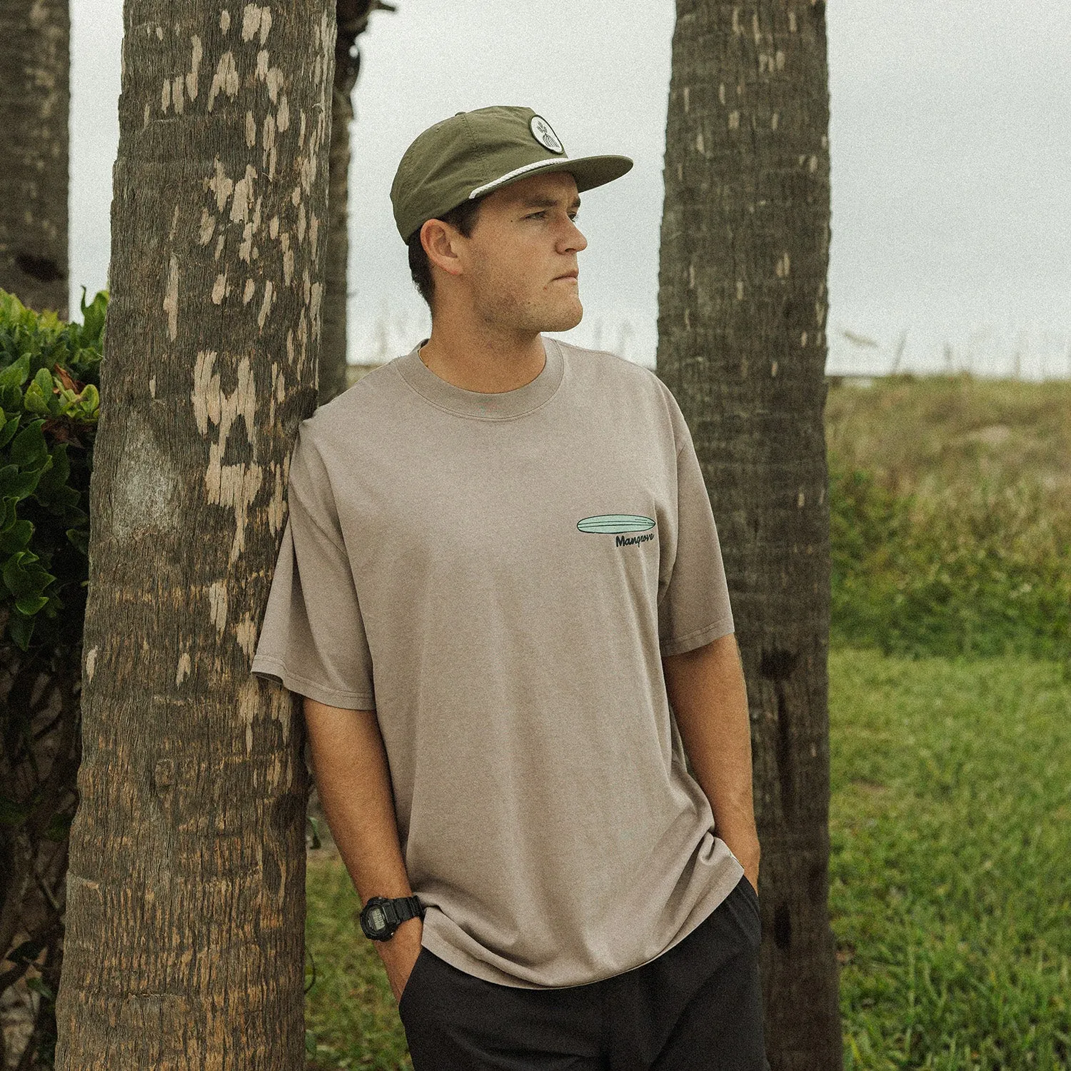
The photography keeps the clothes close to the coast, but avoids turning the work into generic surf imagery.
05 · Built to continue
A brand the family could keep shaping.
The goal was never to make Mangrove dependent on one person’s taste or attention. It was to give the next generation enough structure to make good decisions and enough room to make the brand their own.
My son leads the company now. New products and campaigns continue to come from the same foundation, while three percent of every sale supports mental health, foster families, and the coastal community through the Ripple Effect.

Family-run built to move into its next generation
23k+ people following the work
3% of every sale committed to the Ripple Effect