Penguin Packaging

Building a warm, recognizable brand for a full-service packaging company, then carrying its character across the website, campaigns, customer stories, and everyday details as the business grew from launch to $40M+ in gross revenue.
Visit Penguin Packaging Solutions01 · The assignment
Give a full-service packaging company a more human way to show up.
Penguin entered a crowded packaging market with a practical advantage: its founders understood the work from inside the industry and cared deeply about how customers were treated.
The brand needed to make that care visible. The opportunity was not to make packaging feel frivolous, but to give a technical, relationship-driven business a voice people could recognize and enjoy hearing from.
02 · The character system
Start with a penguin. Let the personality grow from there.
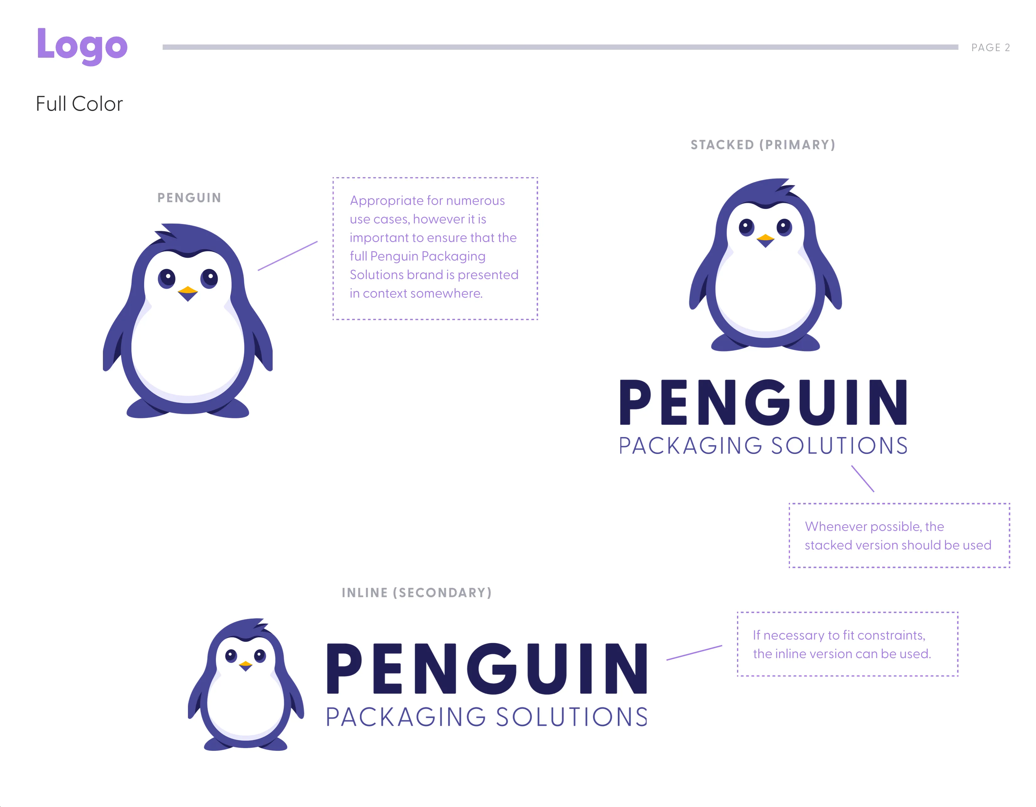
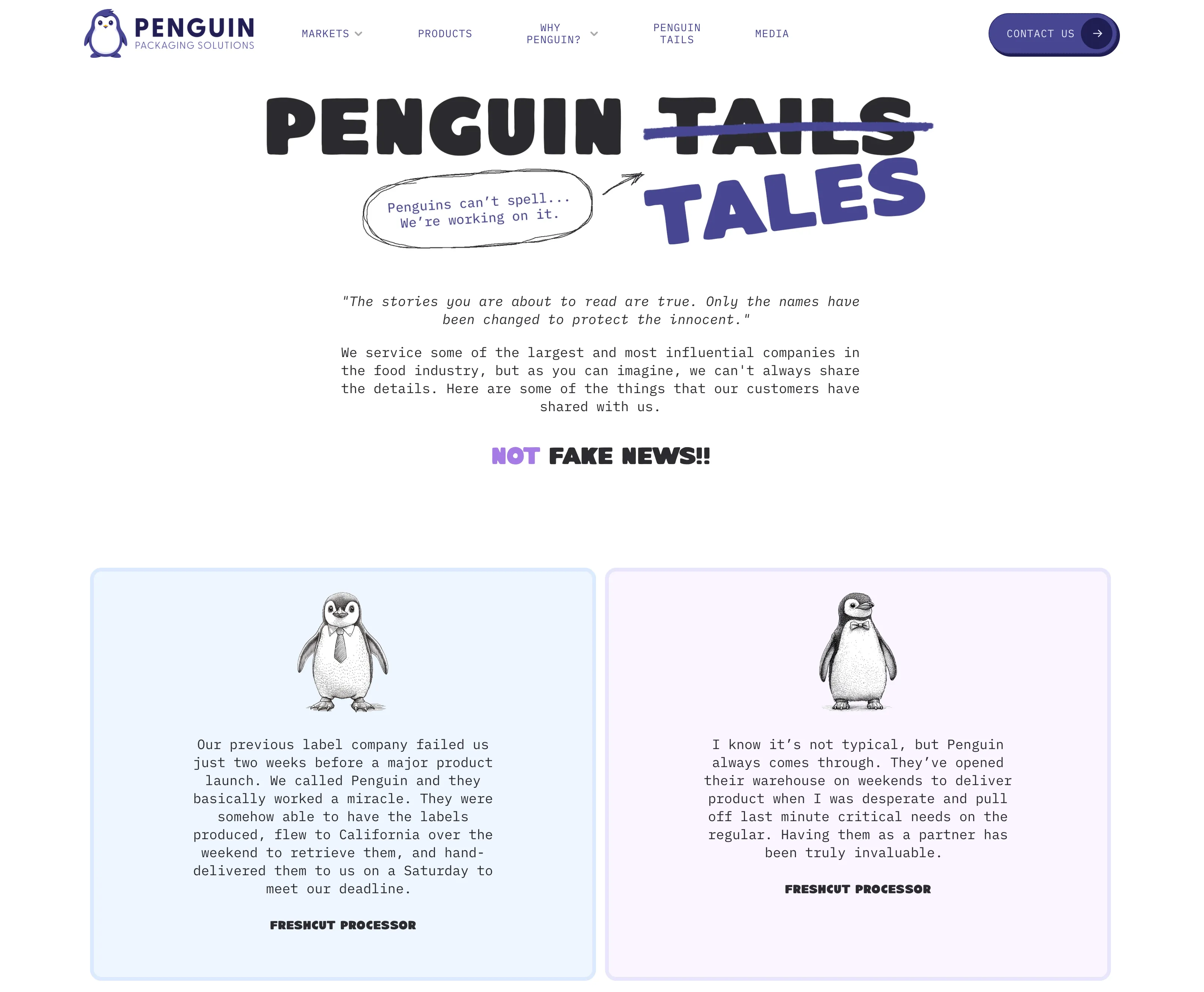
Waddles gave Penguin an immediate point of recognition, but the mascot was only the beginning. The identity paired a calm blue and violet palette with hand-drawn illustration, plainspoken copy, and room for an occasional pun.
The humor worked best when it helped explain something real. A market, a product, or a service remained the subject. Waddles simply made the conversation warmer and easier to remember.
03 · The website
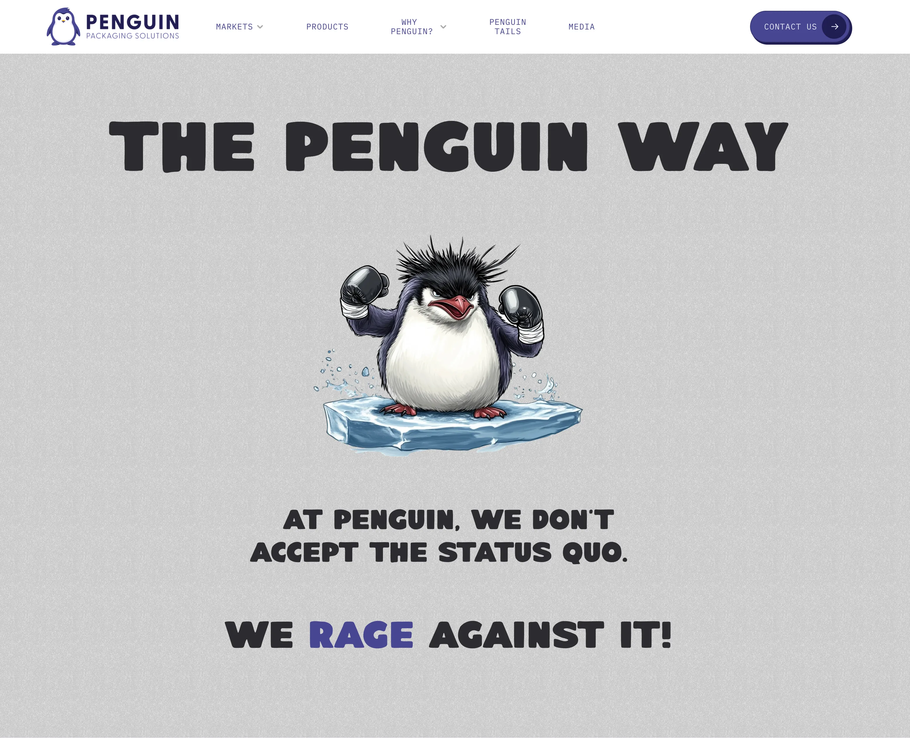
Make the useful work easier to understand.
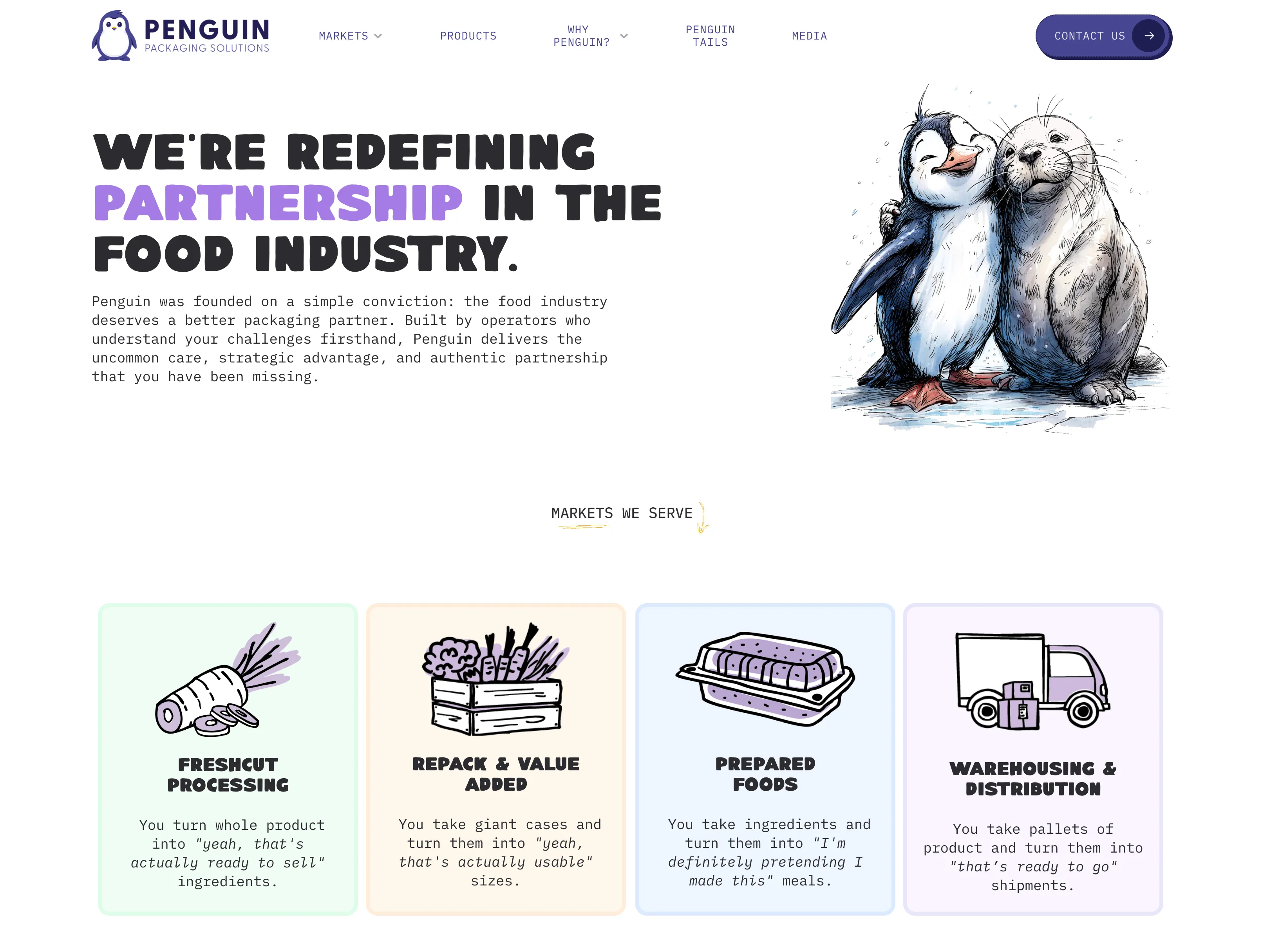
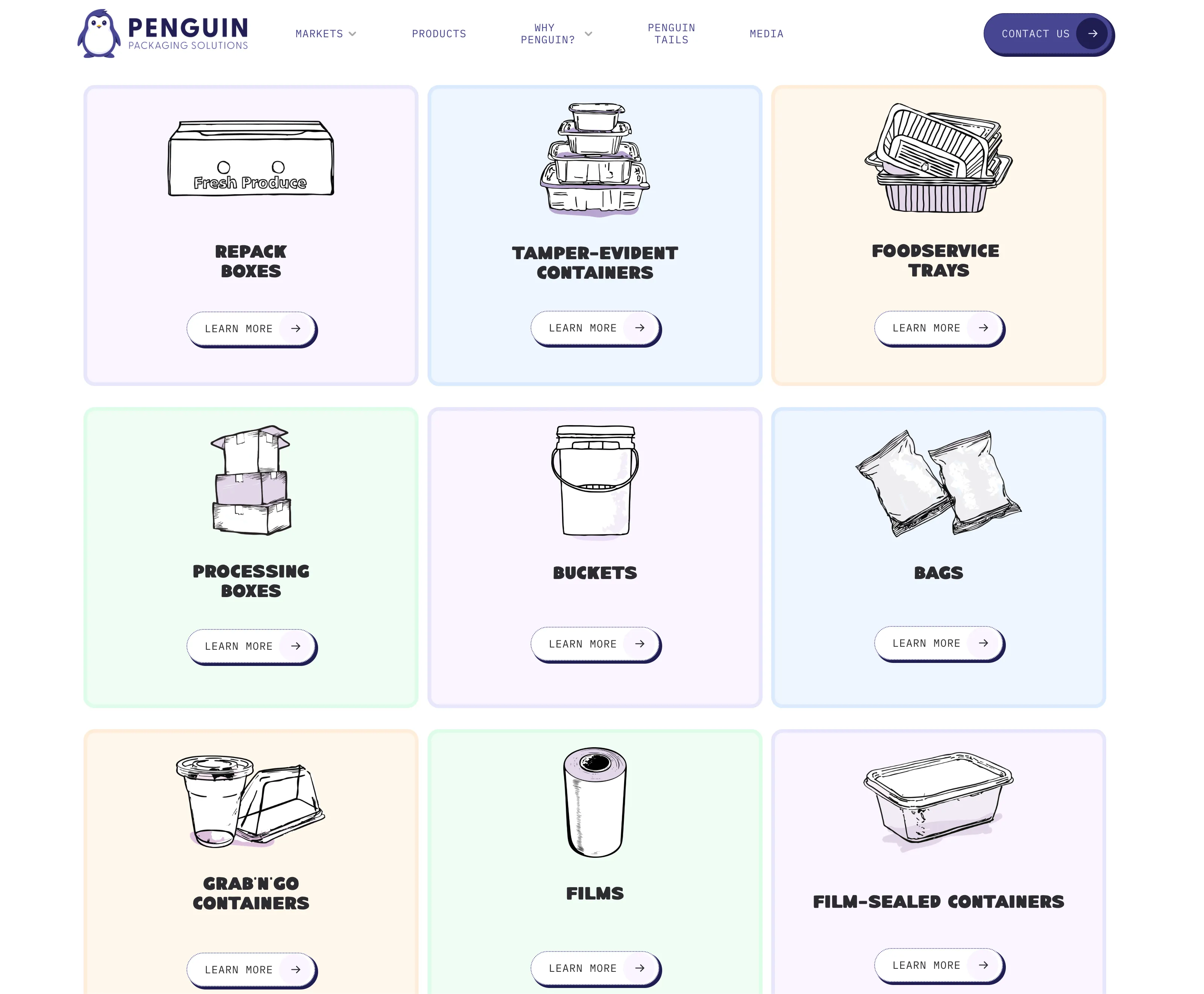
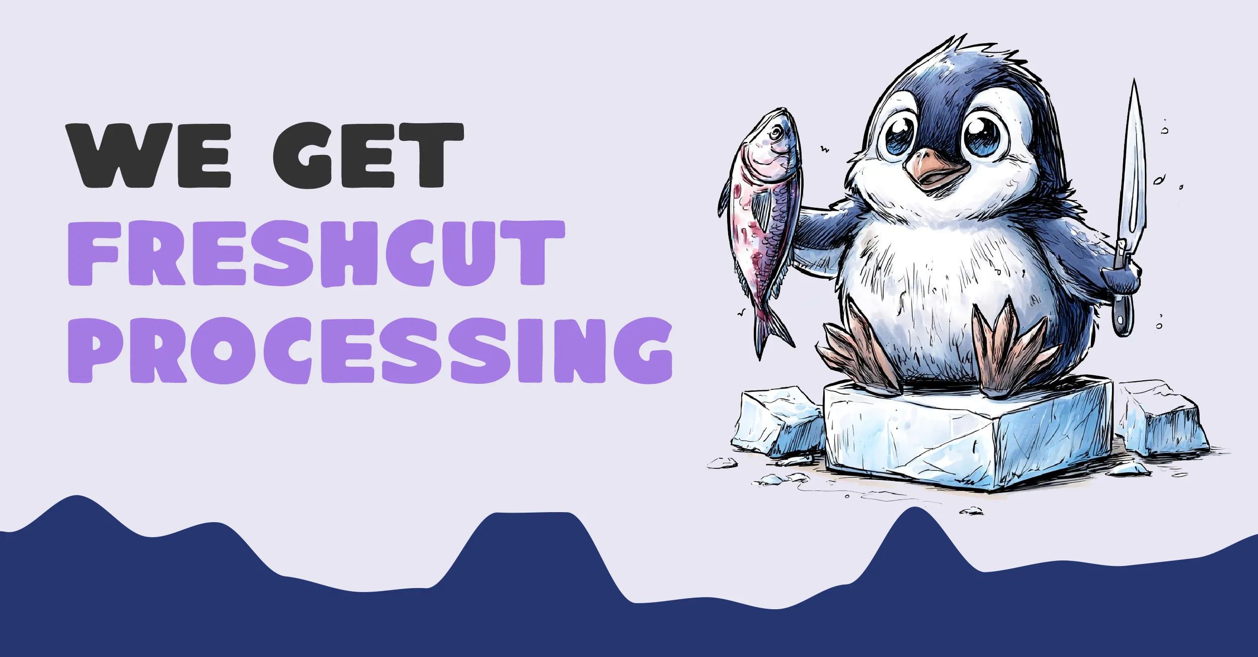
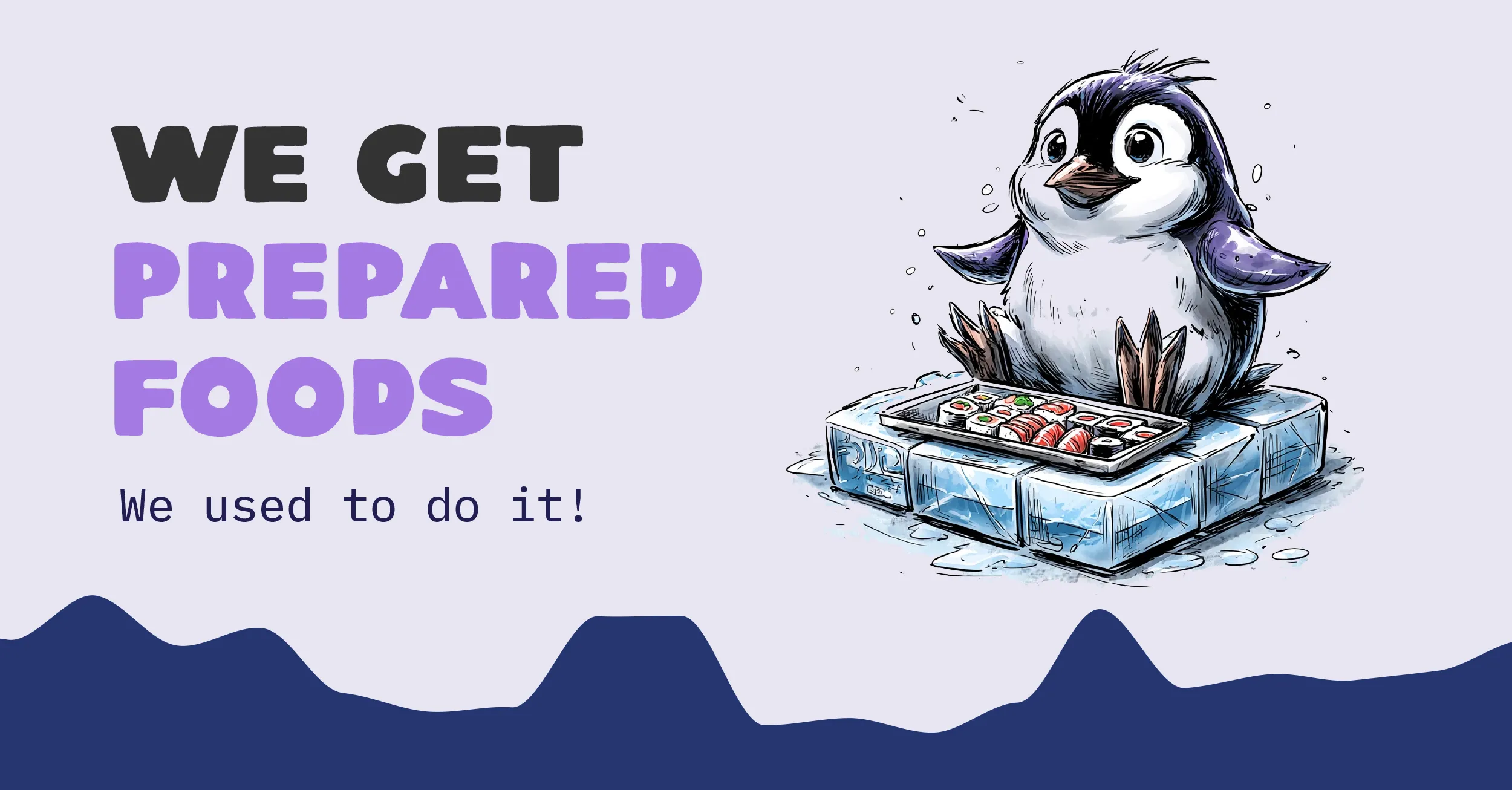
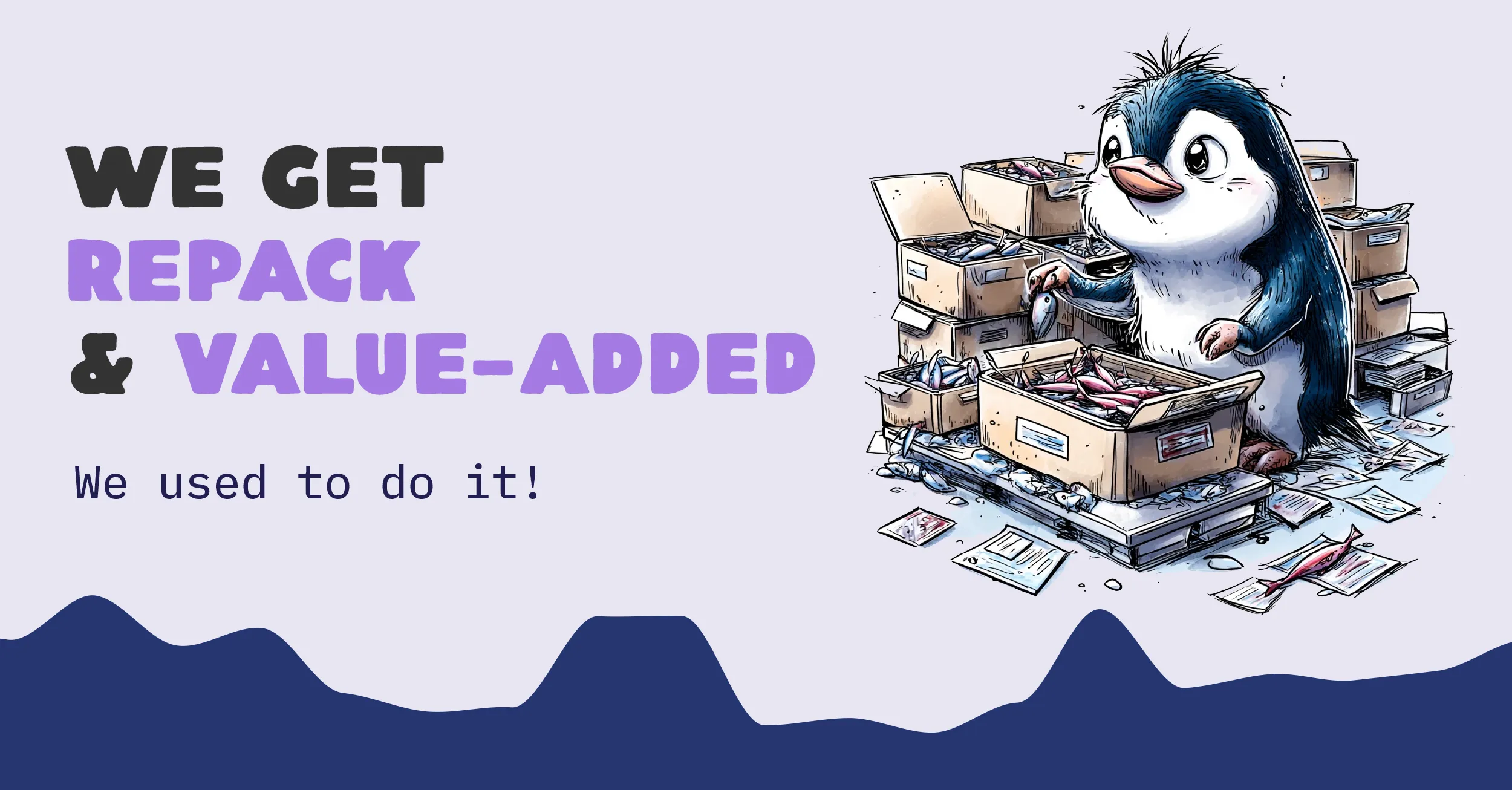
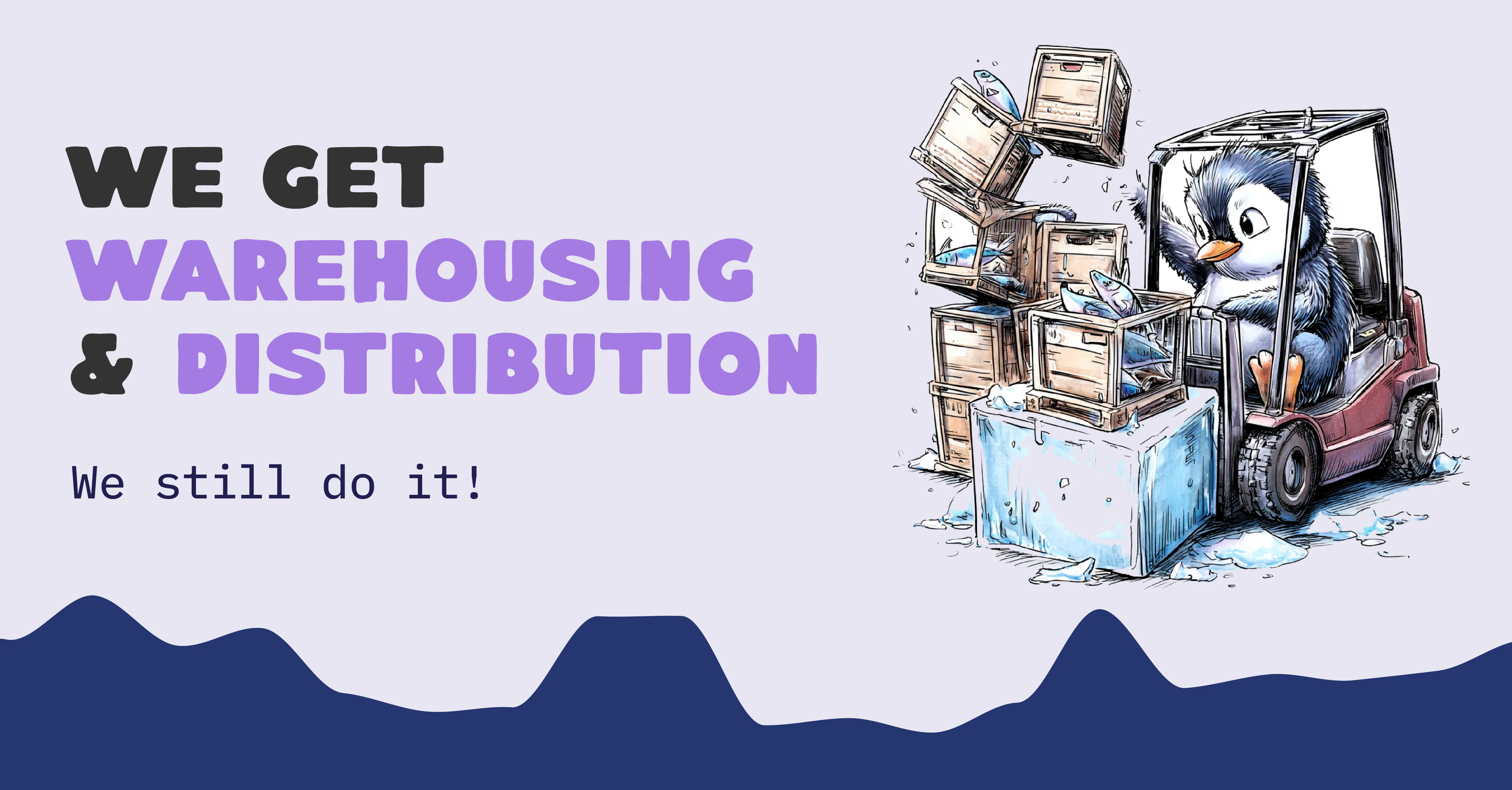
The site had to connect a broad product catalog with fresh-cut processing, repack and value-added, prepared foods, and warehousing and distribution. Illustration and short, conversational descriptions gave each capability its own entry point.
04 · The ongoing voice
Keep the joke close to the work.
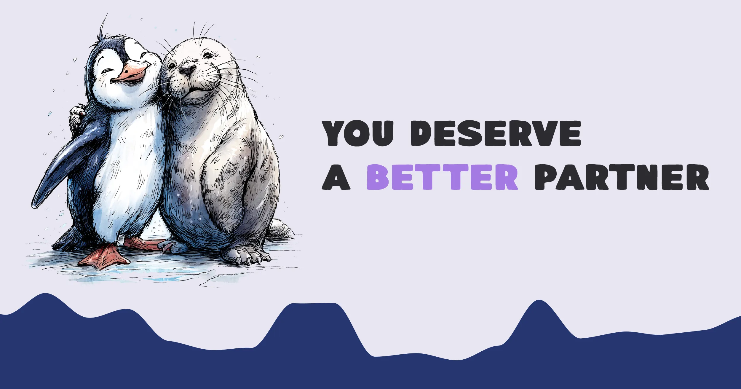
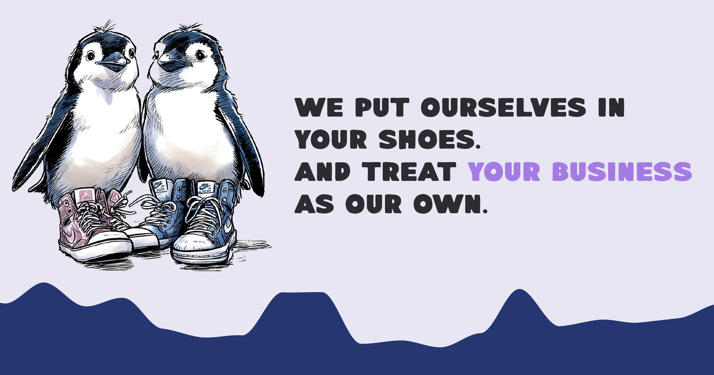
A character-led brand can become repetitive quickly. The campaign system avoided that by beginning with the customer’s world: what they process, what they pack, what they store, and where they need help.
The illustrations changed with the subject while the voice stayed familiar. Some messages were direct, some lightly absurd, and some simply reassuring. Together they made Penguin feel consistent without making every post the same.
05 · Beyond the campaign
Make the details feel personal too.
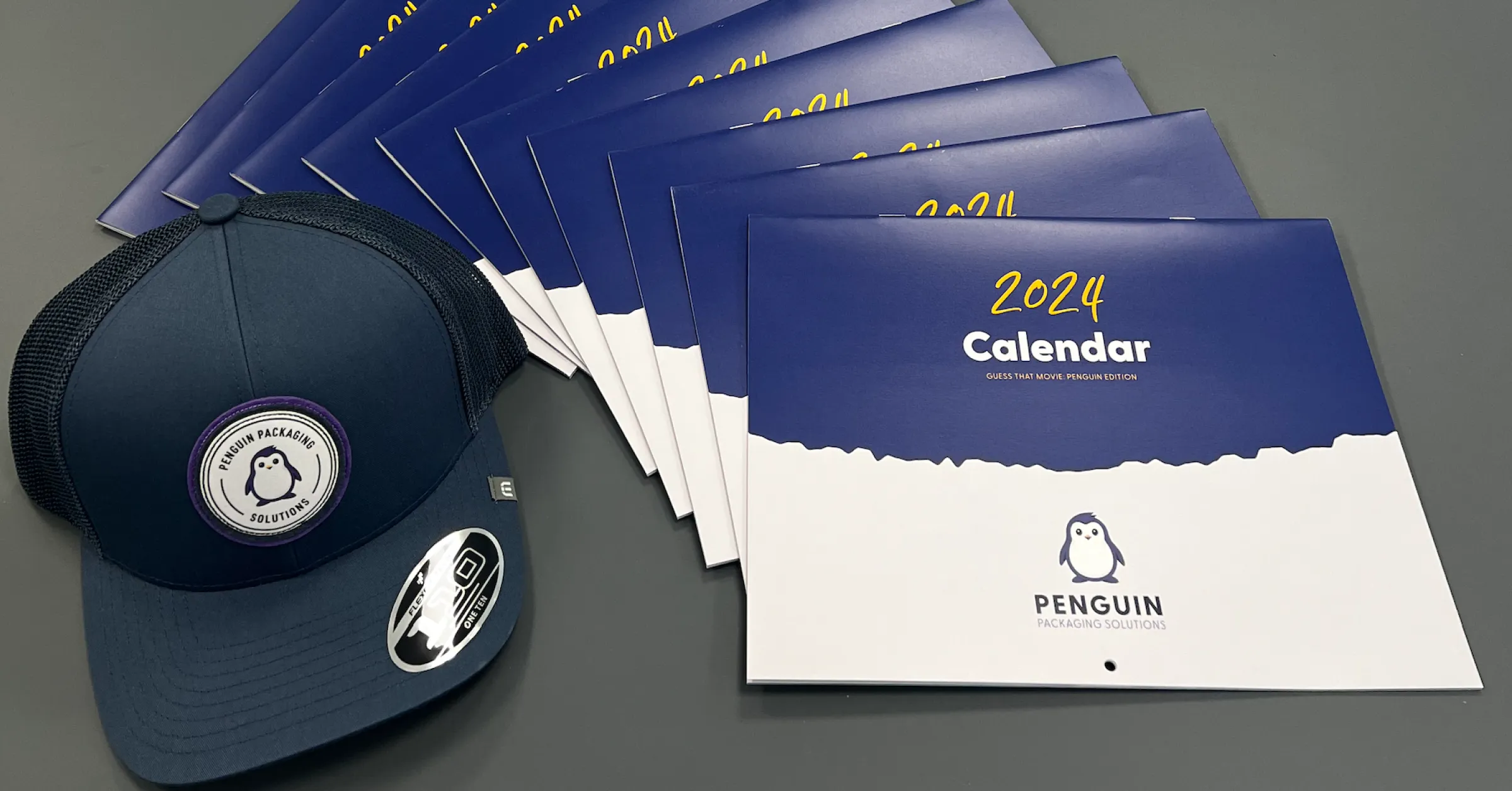
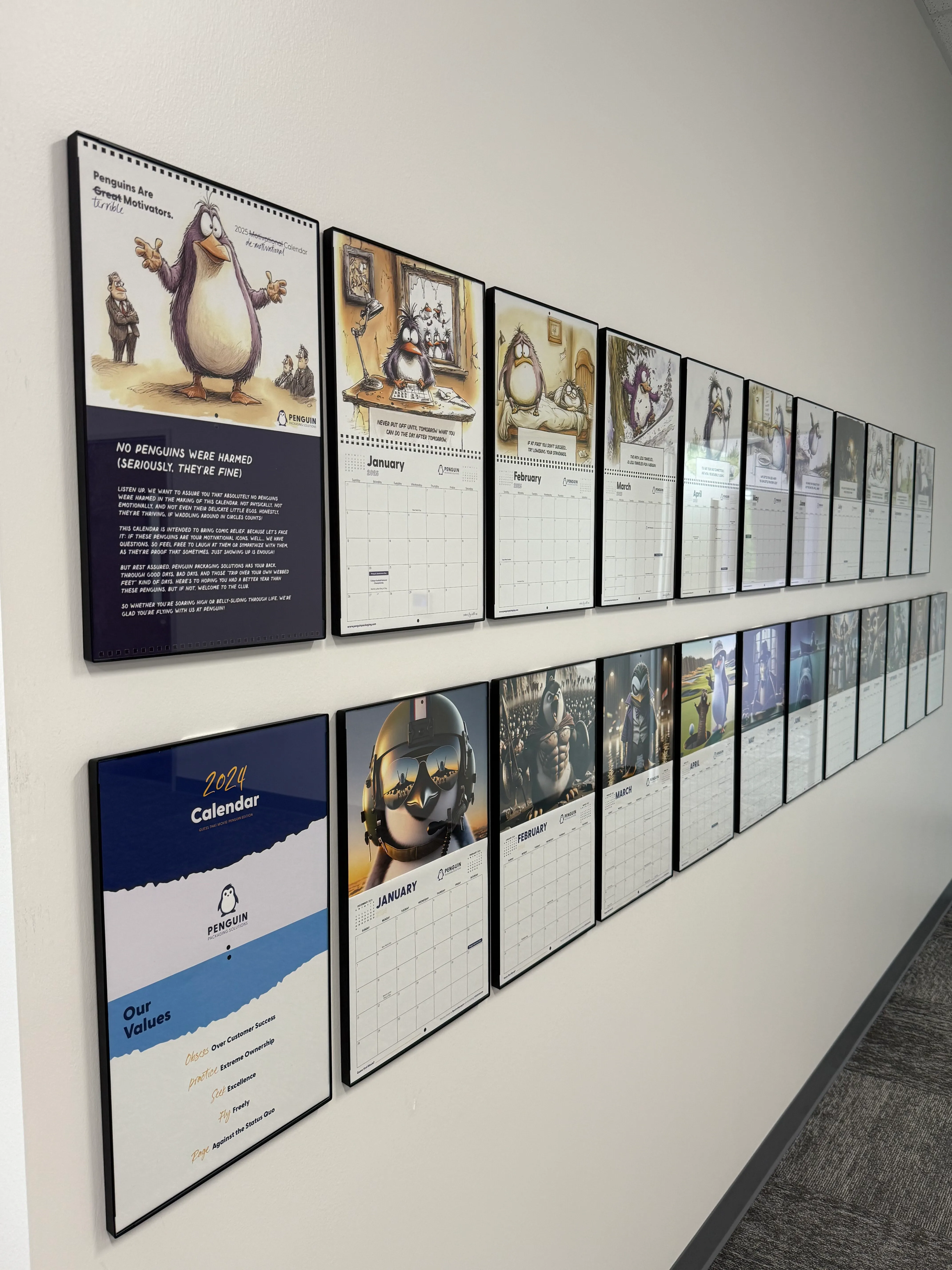
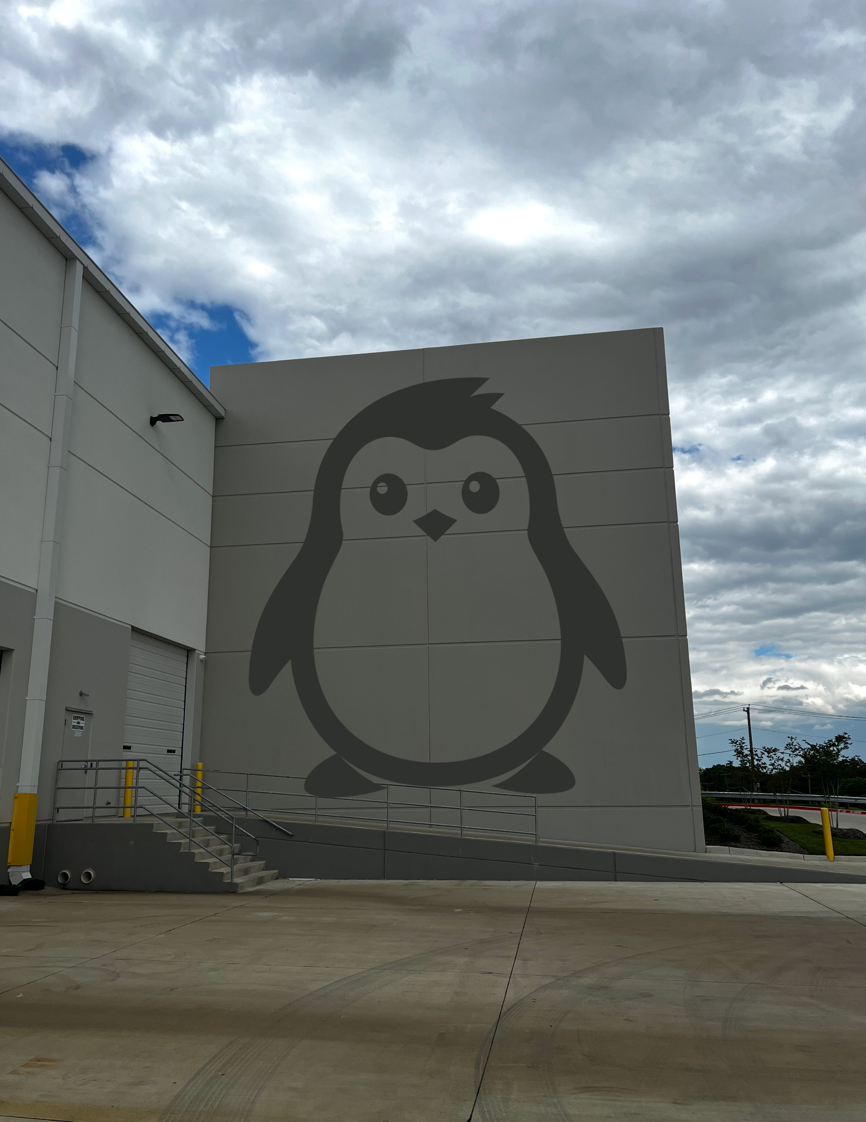
The brand became most useful when it moved beyond marketing. Calendars, customer gifts, office graphics, and the warehouse itself gave the personality a place in everyday relationships.
Those details did not need to sell anything directly. They gave customers and employees small reminders that there were thoughtful people behind the operation.
$40M+ gross revenue since launching in 2021
One voice from product pages to customer gifts
Daily use across sales, marketing, and the workplace