Arnold Palmer Hospital
Turning a trusted children's hospital logo into a complete brand system, from its central promise to the signs that helped families find their way.
Visit Arnold Palmer Hospital01 · The assignment
Build everything between the logo and the patient.
Arnold Palmer Hospital for Children already had a trusted name and an established mark. What it did not have was a complete language that hundreds of people could apply consistently.
The work was larger than a visual refresh. It meant defining the promise, voice, typography, color, imagery, collateral, and environmental standards, then proving the system across the places where families actually encountered the hospital.
02 · The standard
Design for the person on the other side of it.
In a children’s hospital, brand is not decoration. A parent may be navigating the worst day of their life. A clinician may be moving quickly. A child needs the place to feel less frightening.
Those conditions set the creative standard. Every decision had to make the organization easier to understand, warmer to encounter, and more dependable in use.
Clarity
Help families understand where they are and what comes next.
Humanity
Make a high-stakes environment feel warmer and less frightening.
Consistency
Give hundreds of people one dependable system to work from.
03 · The idea
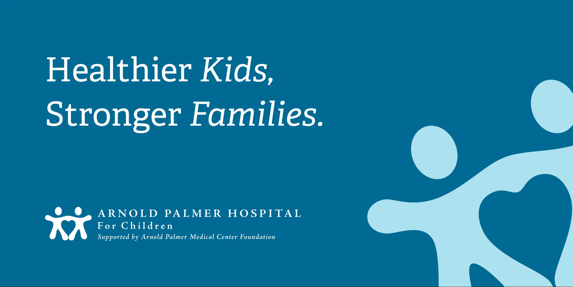
Healthier kids. Stronger families.
One plainspoken promise gave the system a center of gravity. It joined pediatric care with the people and community surrounding every child.
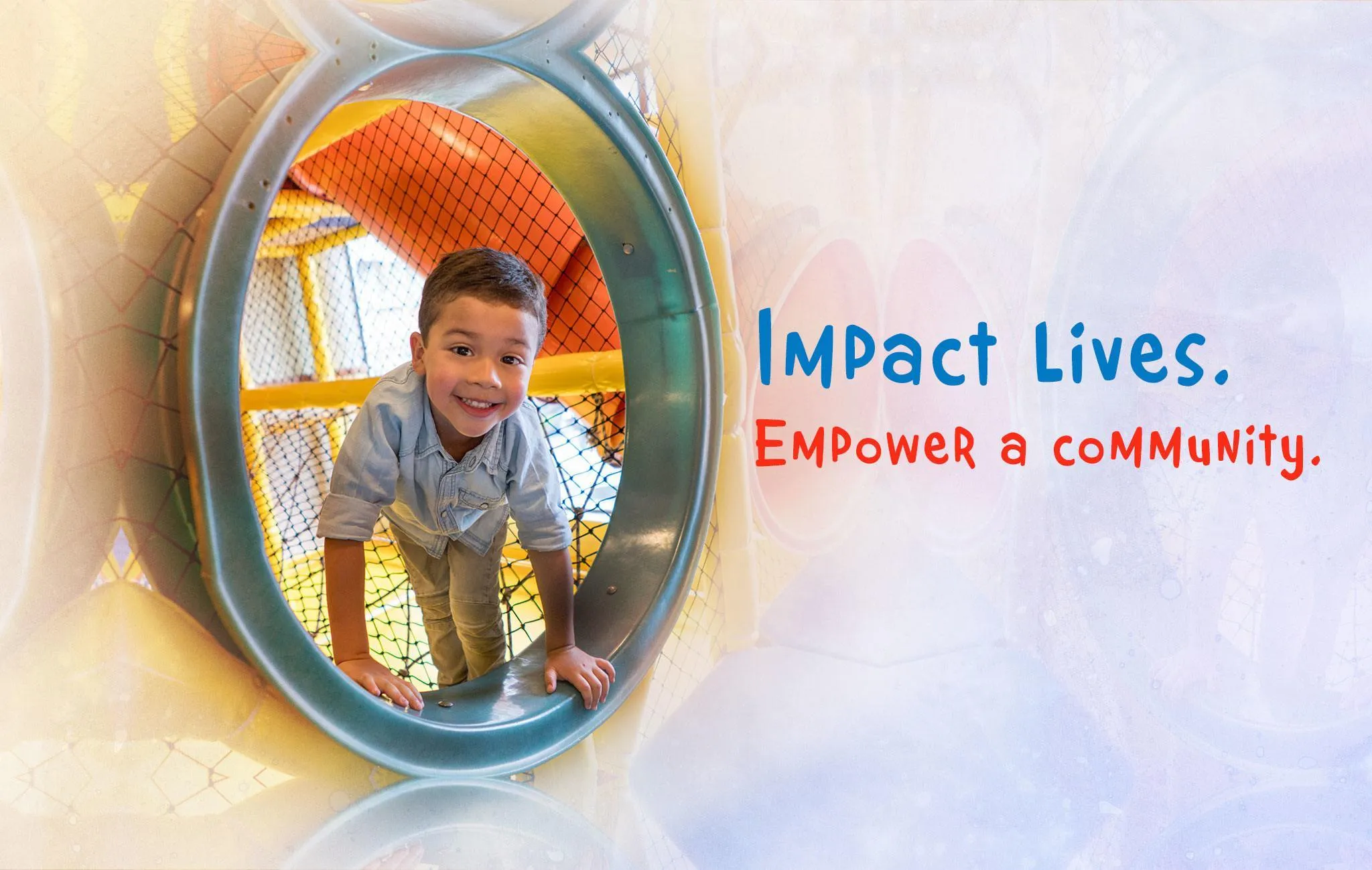
From there, the existing logo became one part of a broader identity. Color, typography, imagery, playful language, and flexible patterns could now work together without losing the hospital’s authority.
04 · The operating system
A brand book made to be used.
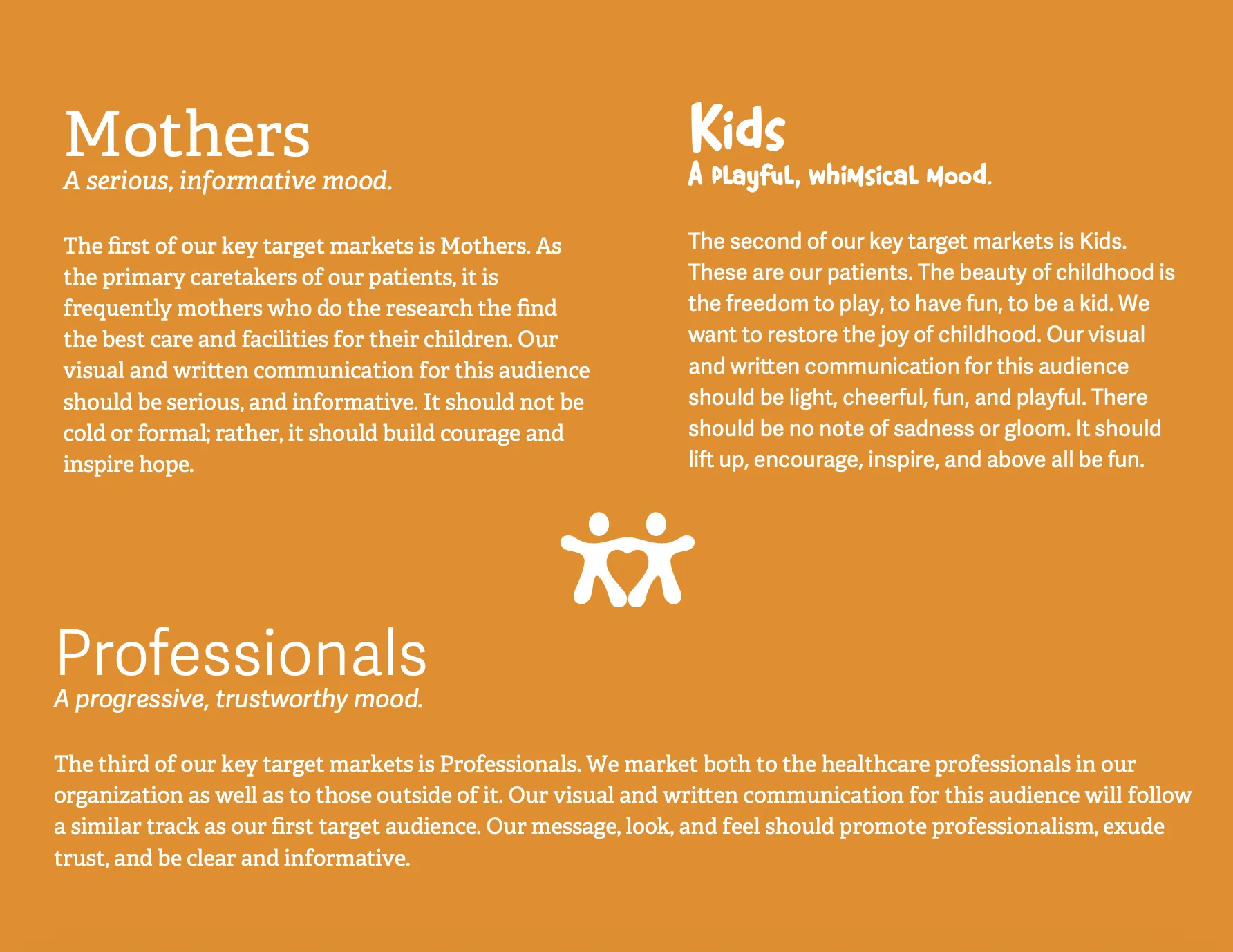
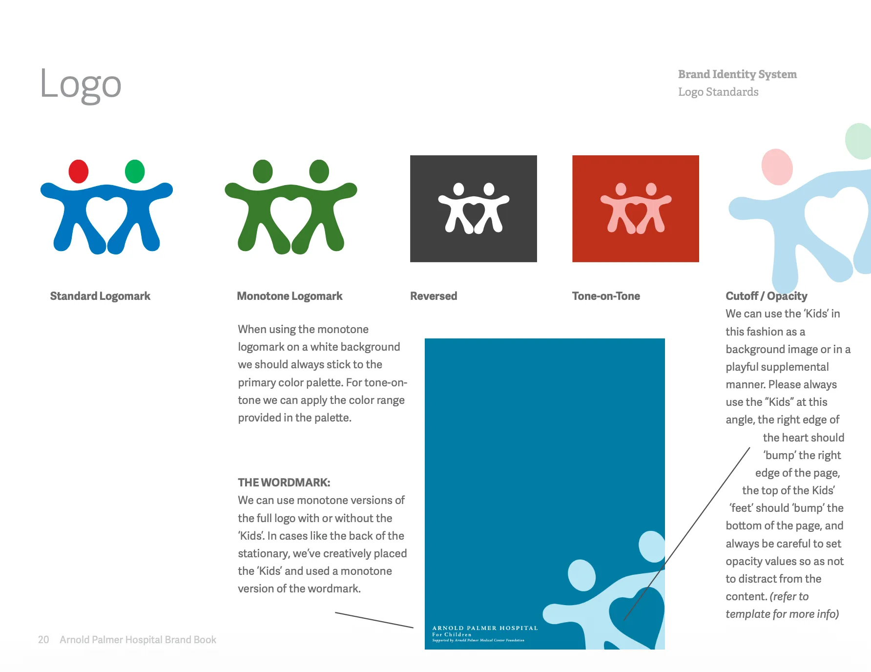
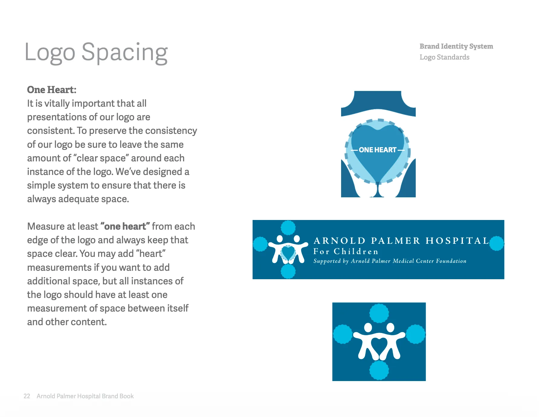
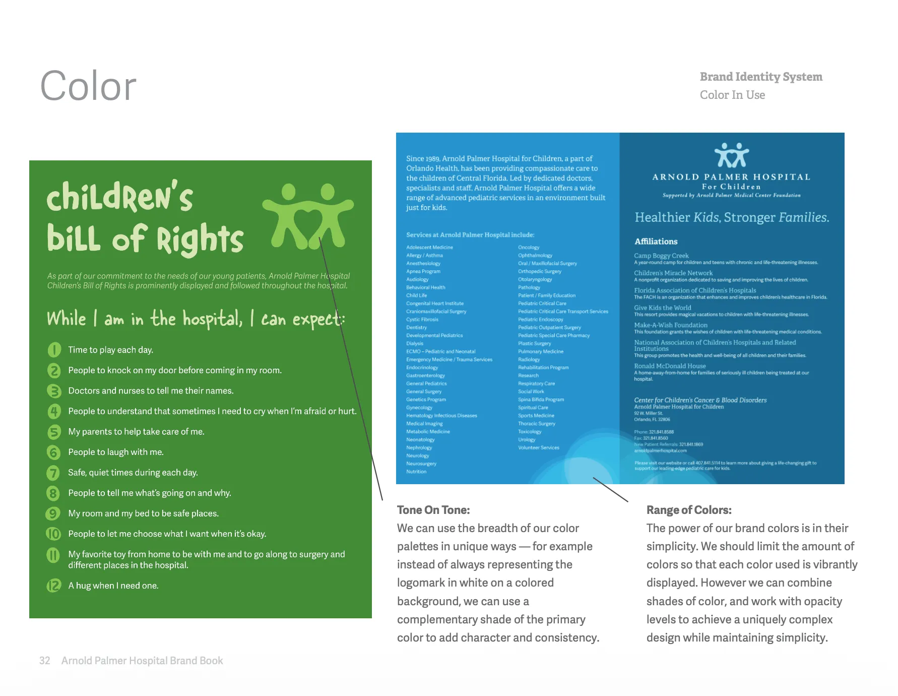
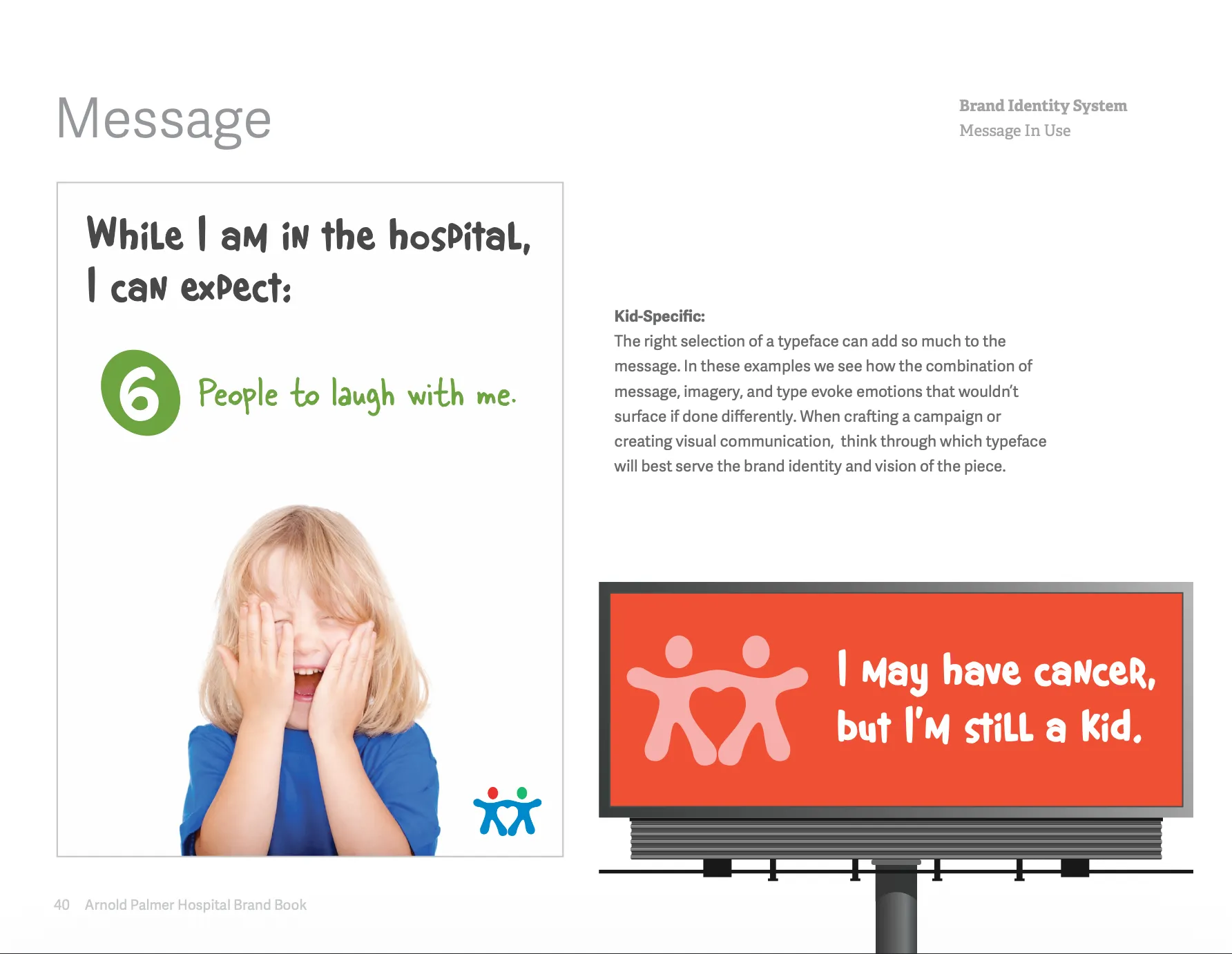
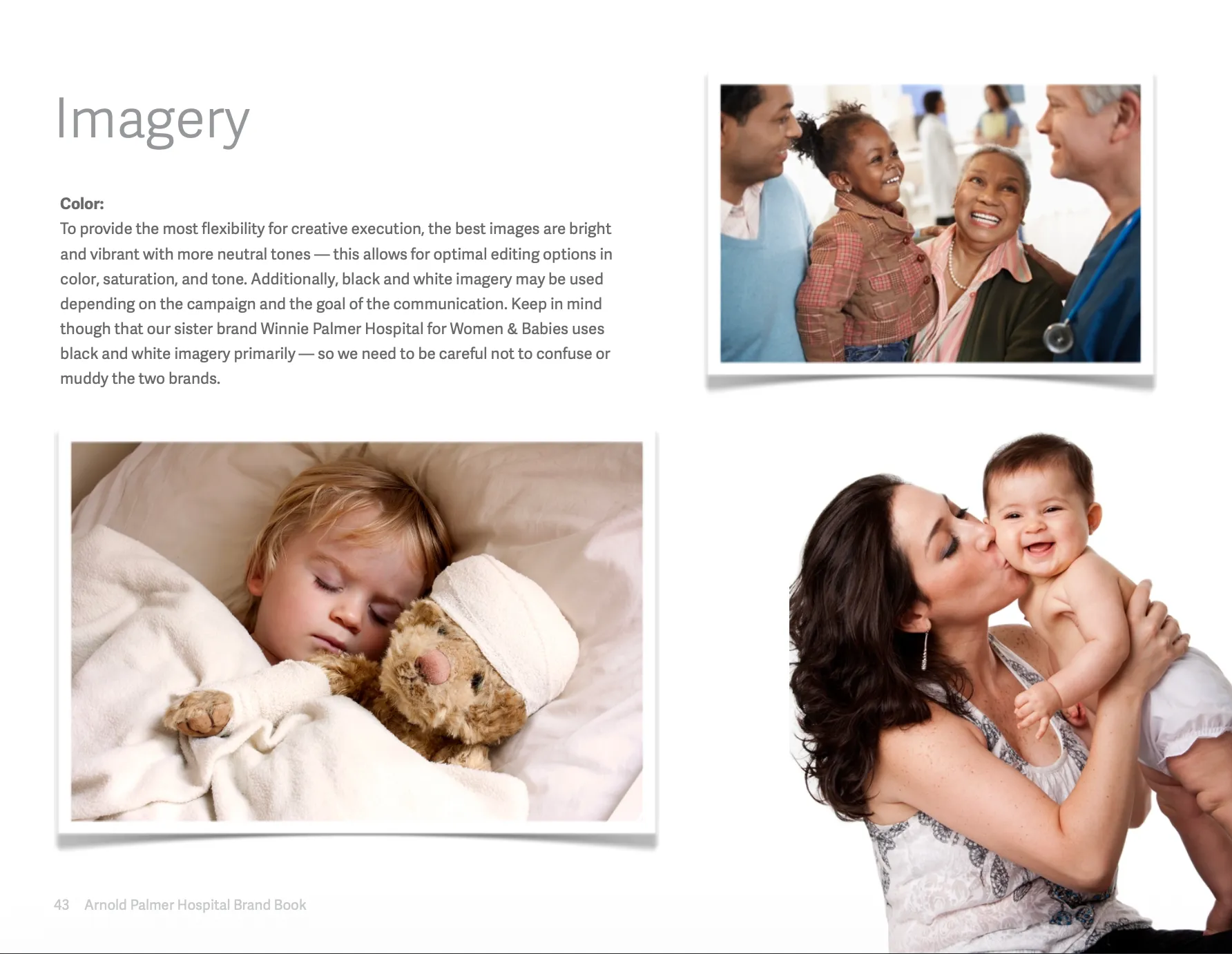
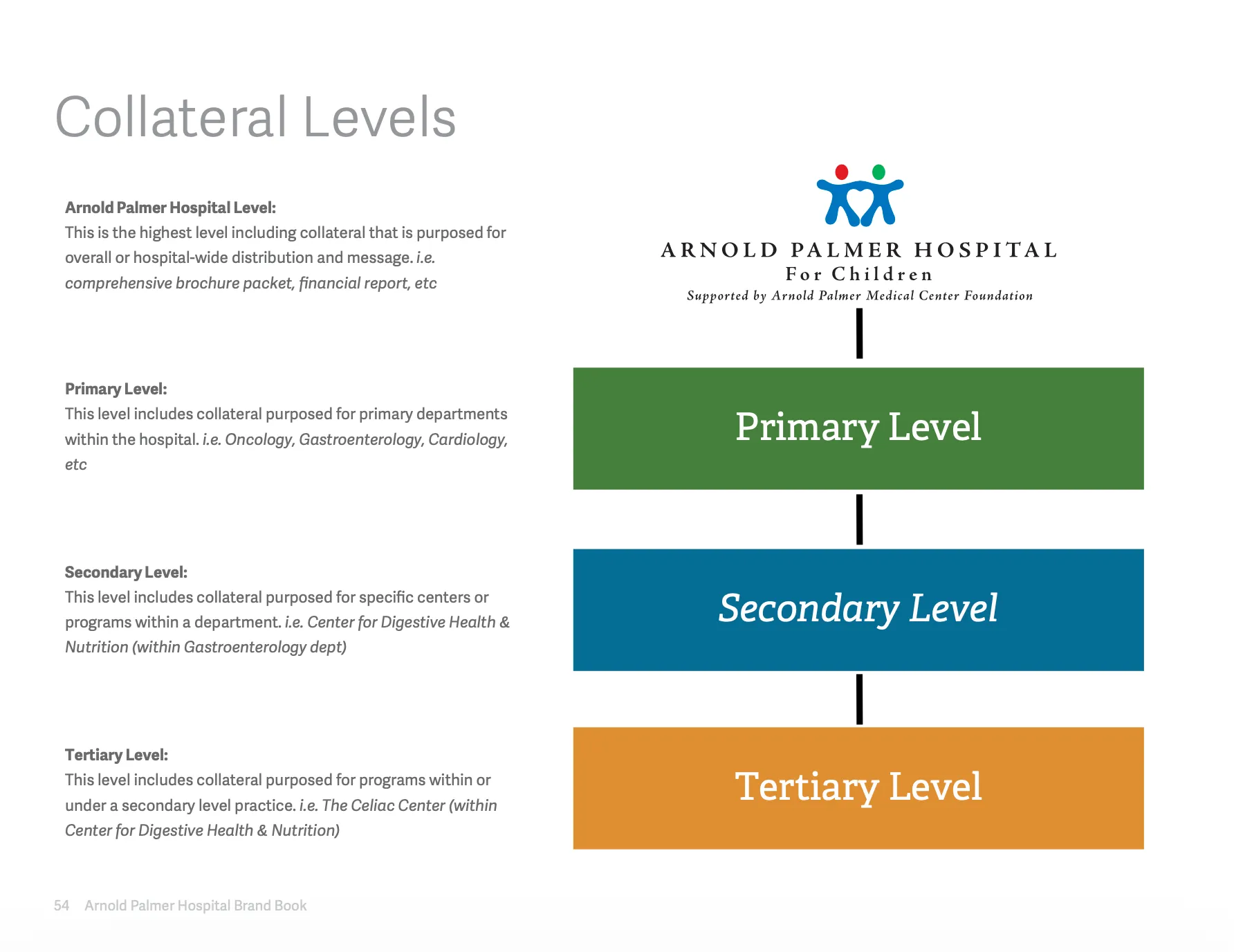
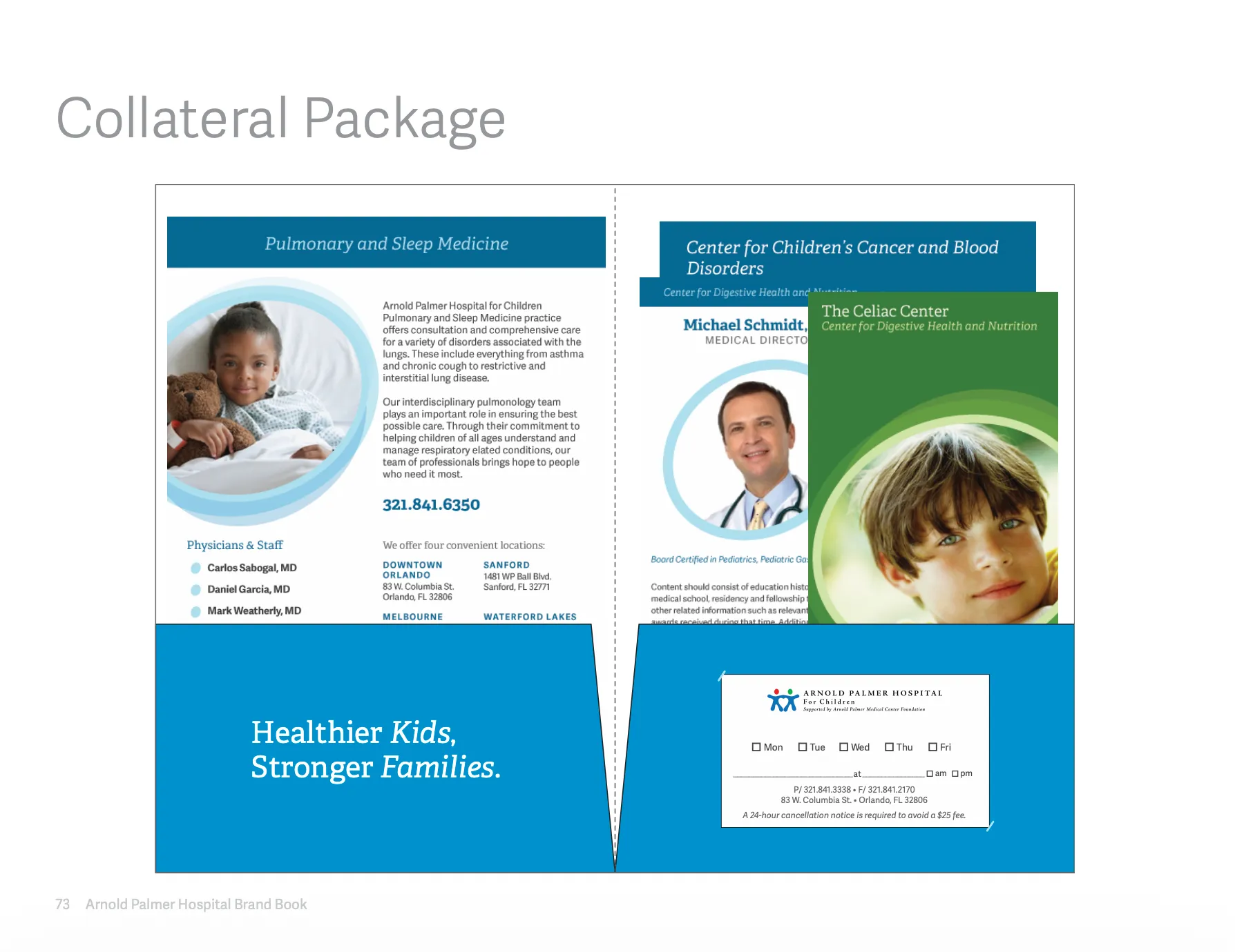
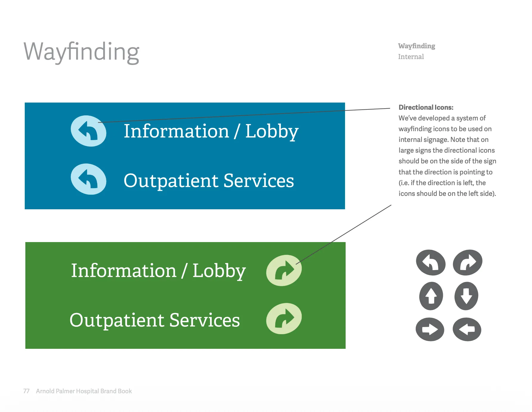
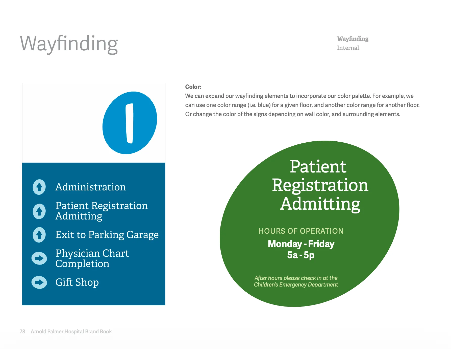
The guide translated creative intent into repeatable decisions. It moved from promise and personality to logo use, color, messaging, collateral levels, and wayfinding.
Cycle through the selected pages as a working manual, not a gallery of disconnected artifacts.
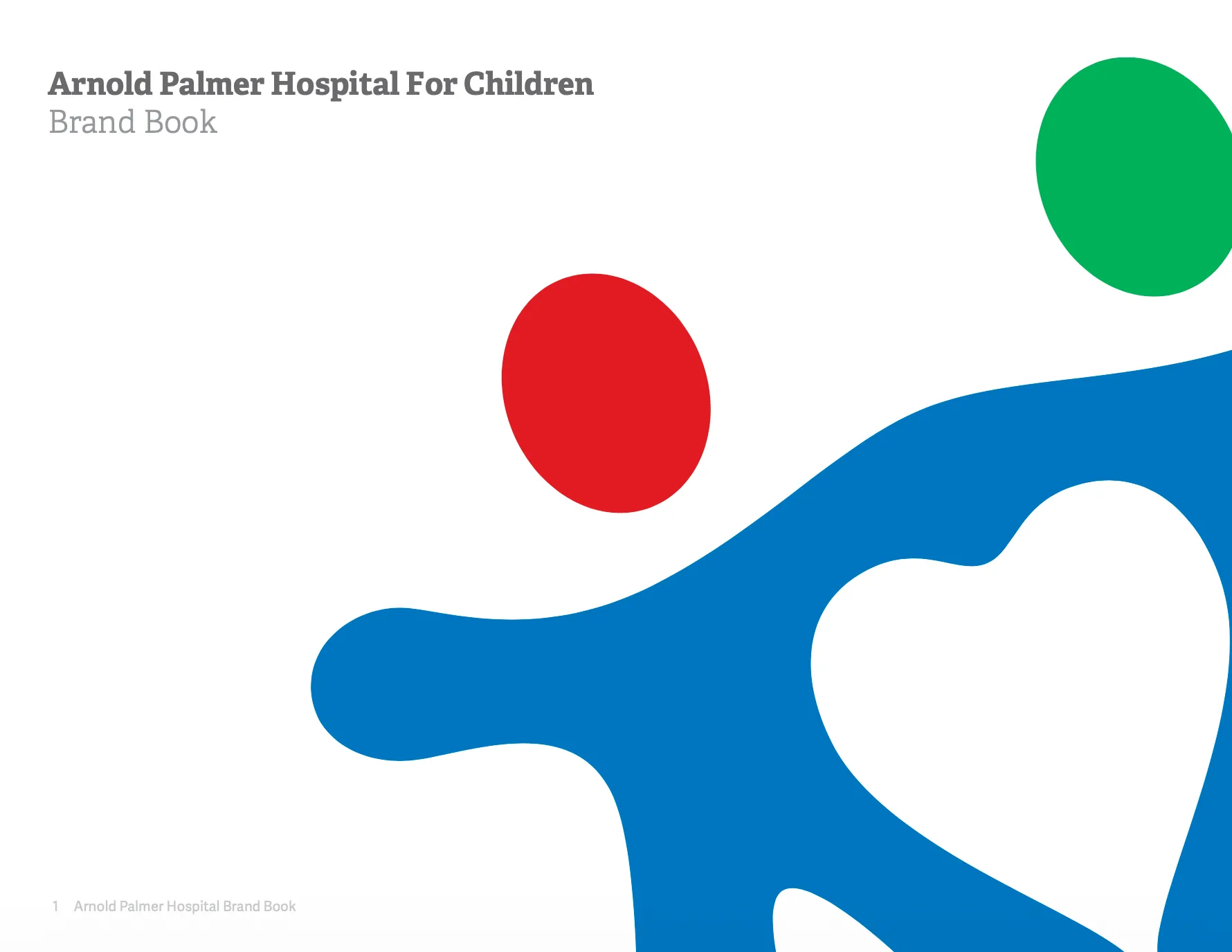
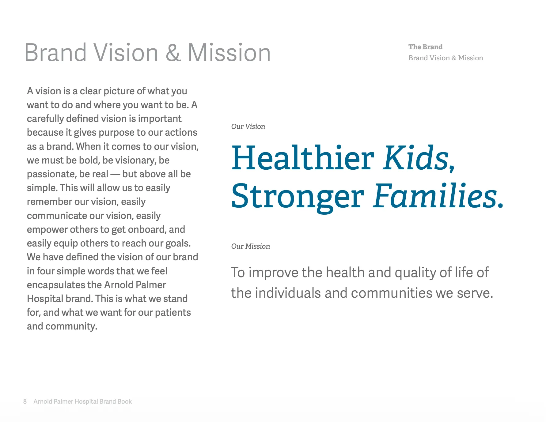
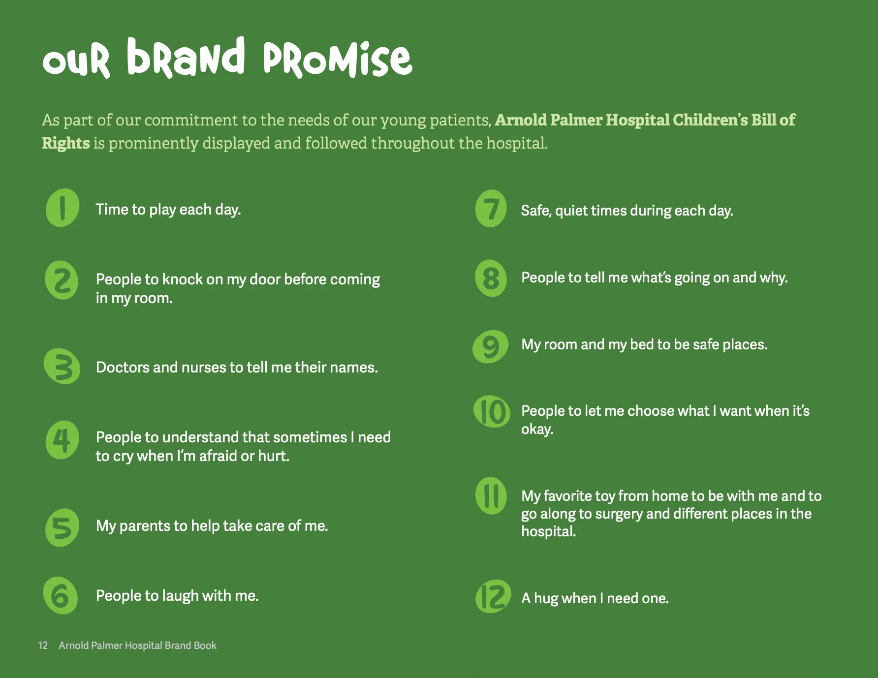
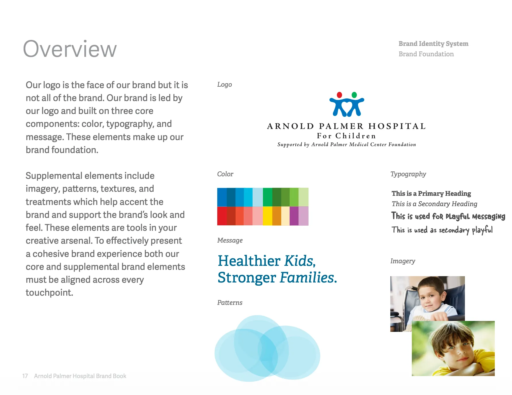
Brand book cover 01 / 14
Use the arrow keys while the brand book is focused.
05 · Beyond the guide
One system across every surface.
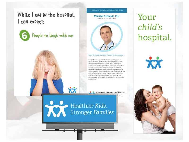
The manual was only useful if it survived contact with the institution. The identity extended into advertising, stationery, donor communication, signage, environmental graphics, web work, and even ambulance wraps.
The goal was not visual sameness. It was recognizable judgment: the same priorities and the same level of care, whether the format was a billboard or a directional sign.
06 · The outcome
A system the institution could run without me.
The engagement turned one mark into a practical brand language and delivered the standards and applications needed to keep it coherent.
Much of that foundation remained in service years later. That endurance matters because the work supported one of Florida’s most consequential care environments, serving children and families when clarity, confidence, and humanity were needed most.
158 beds
15+ years nationally ranked
1 → ∞ logo into a working system